Rebranding a six decades old cooperative federation that works for farmers.
A deep-rooted brand, that is also progressive, visionary, and honest.
Branding
A deep-rooted brand, that is also progressive, visionary, and honest.
Andhra Pradesh State Co-operative Marketing Federation is a government wing that solely works for the farming community. In more than six decades of its existence, they have brought about several changes in the way natural produce is marketed so that farmers are benefited. To rebrand such a heritage brand is a challenge that demands a progressive outlook but within traditional boundaries.
Like many cooperative federations, AP Markfed is known for its people-centered service. So, a government-owned brand needs a separate identity as it does not solely operate for profits. The agency is welfare. To capture this social perspective, AP Markfed needs an approachable, reliable, and relatable logo and brand voice to move closer to the new generations.
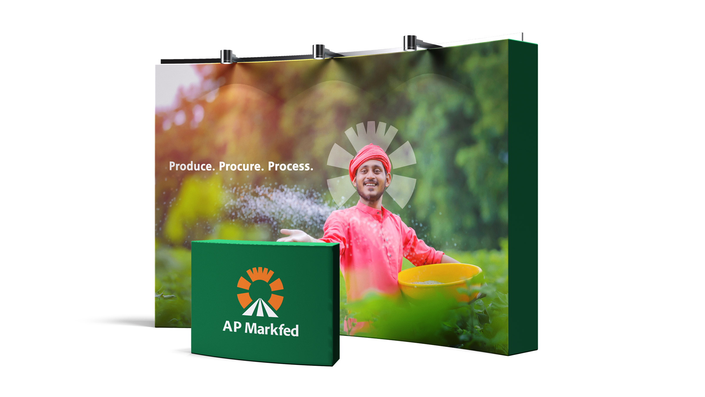
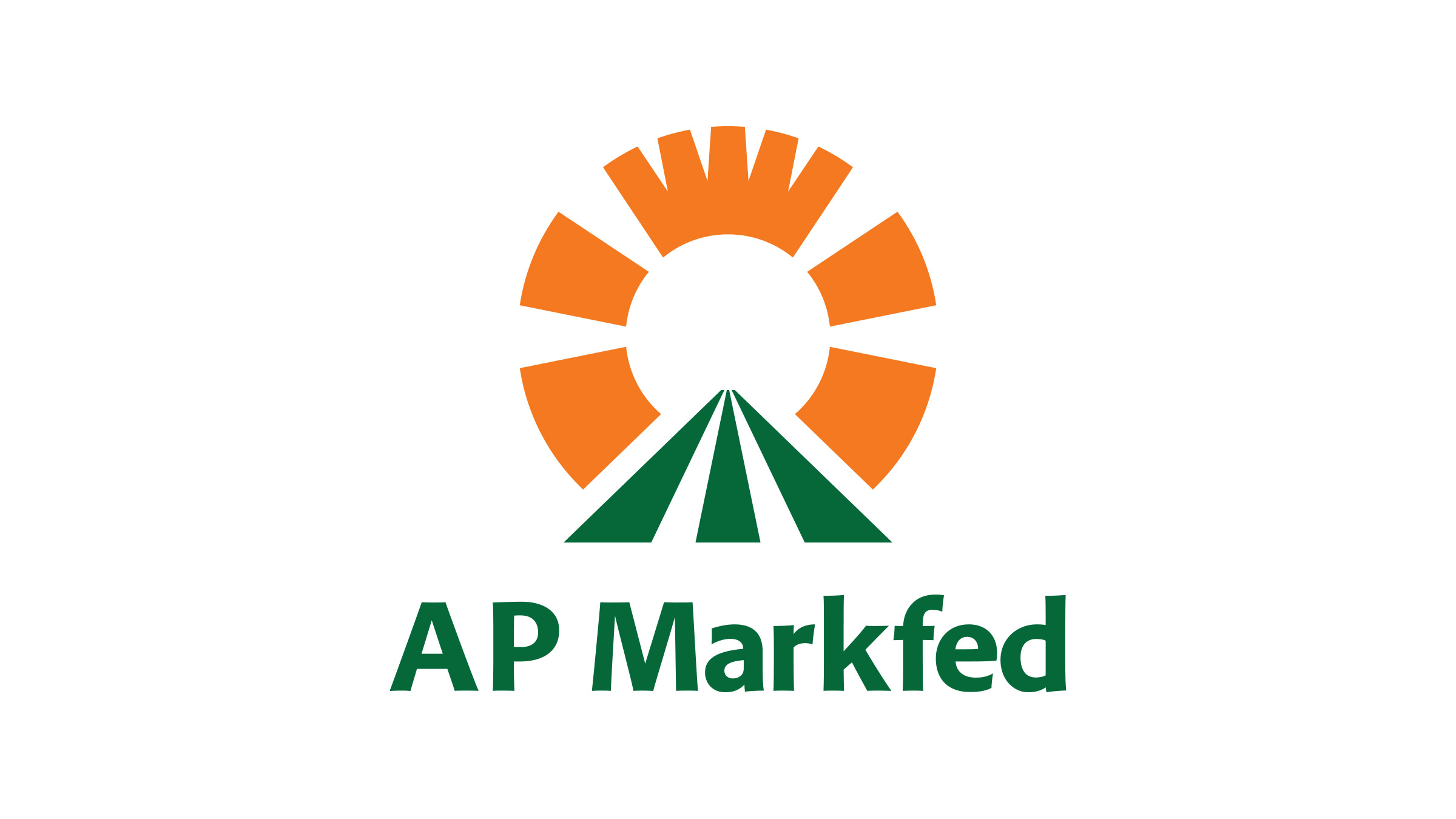
As the farmer is the king in India and the king wears a crown, we used that element in the logo. We derived the position ‘Produce. Procure. Process’. We turned this positioning into trusted paths (three green stripes) leading to prosperity (the sunrays) and eventually victory (the crown on top). It communicates the purpose in a very earthy, sublime manner.