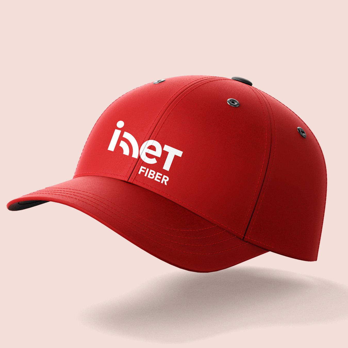
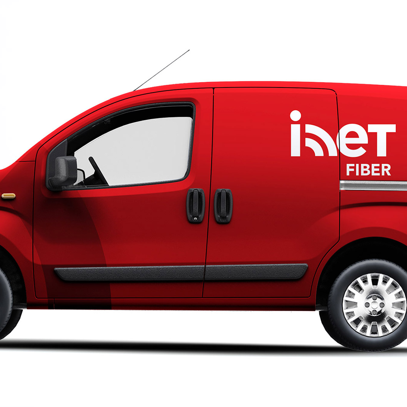
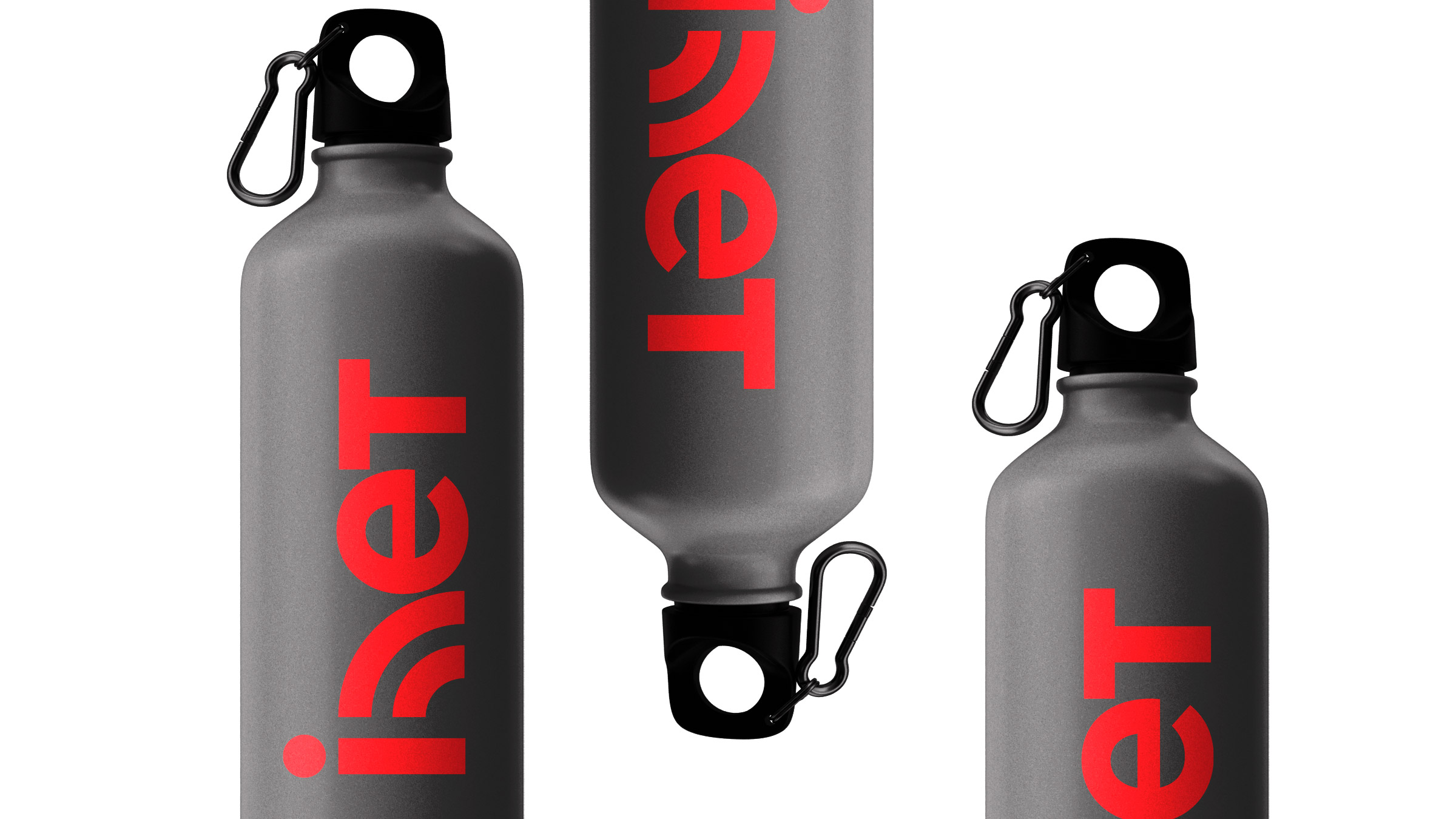
Visual manifestation of broadband.
It looked like inet fiber had good space to play in the market but lacked a nice jersey. See how it built recognition.
Branding
It looked like inet fiber had good space to play in the market but lacked a nice jersey. See how it built recognition.
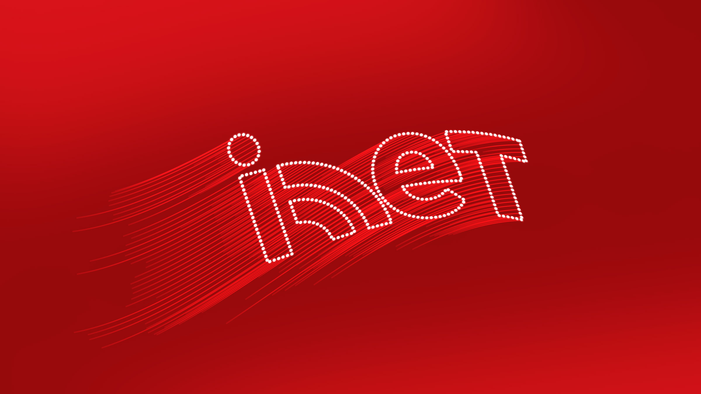
inet fiber needed a visual hook for its audience to remember and recall the brand easily. As the industry is pretty scattered with several players in the field, quality and speed affect the consumer decision. All its competitors have a straightforward brand identity, without any element of surprise. The task is to help the brand stand out.
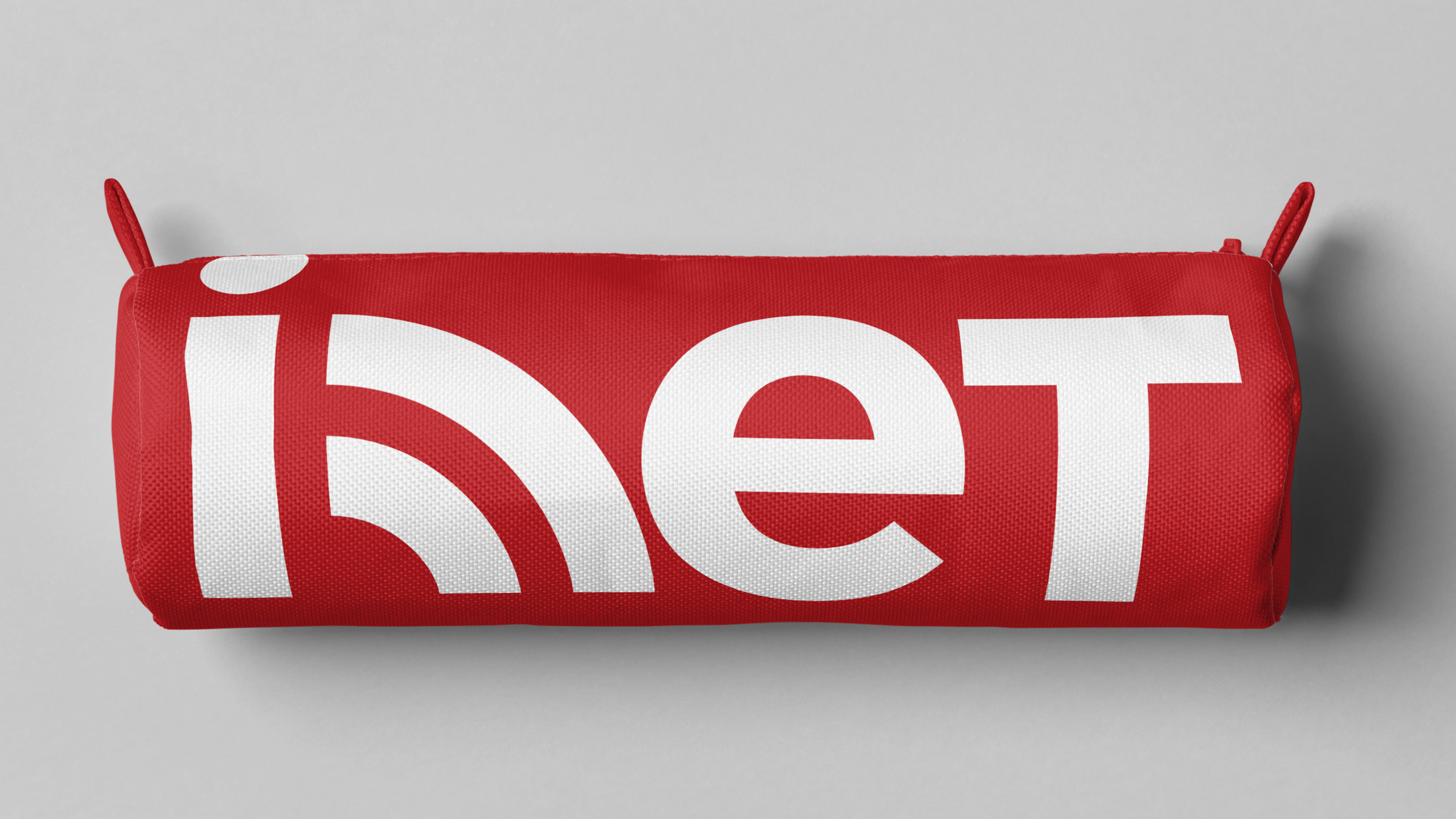
To stay relatable, inet needs both visual and verbal elements that give it a touch of newness. We resolved that it needs a visual element embedded in the logo. Starting with the logo, we worked towards finding a modern symbolic element that sits well with a wordmark logo. To complement it, the brand needs a voice that talks about speed.
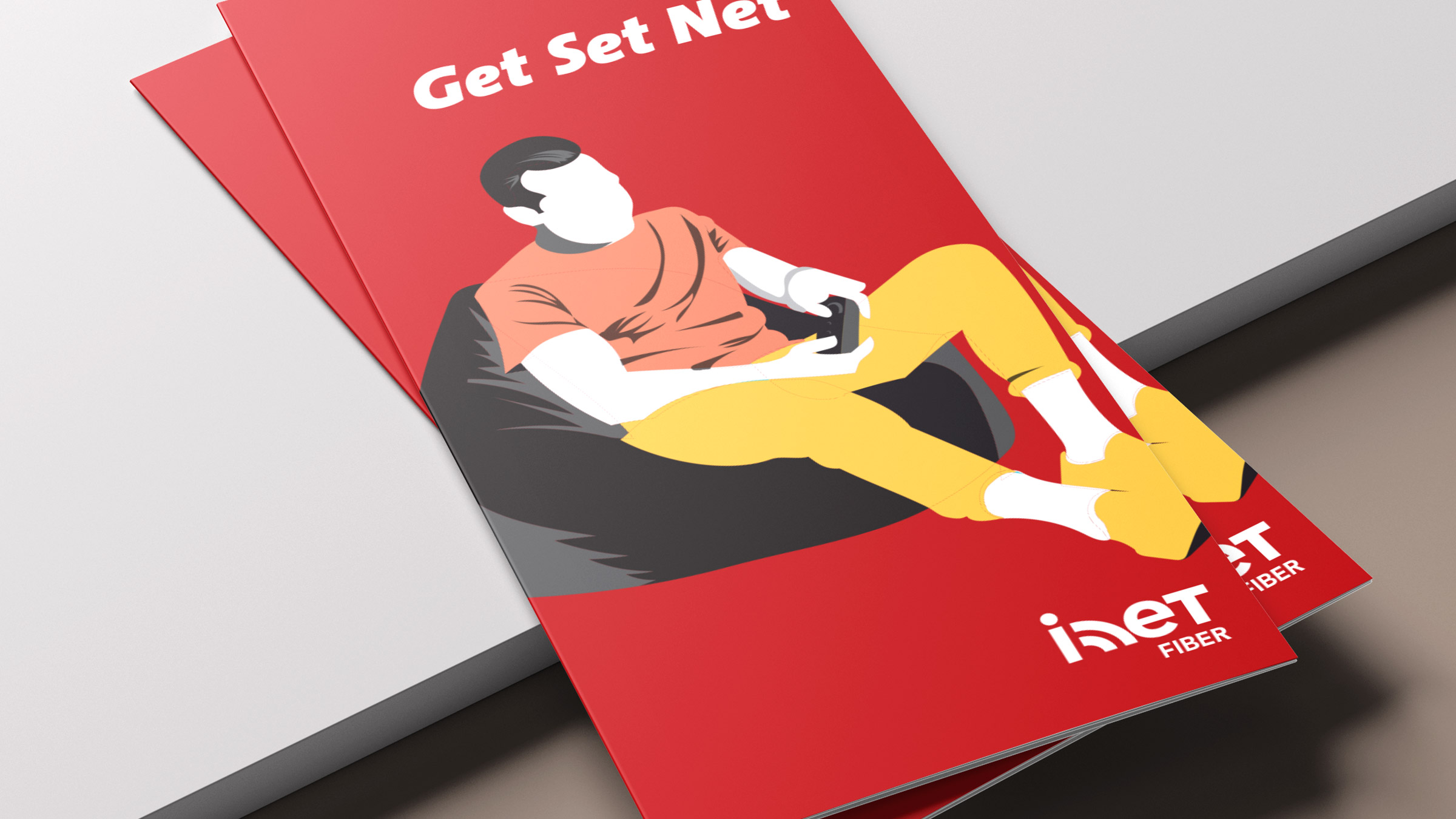
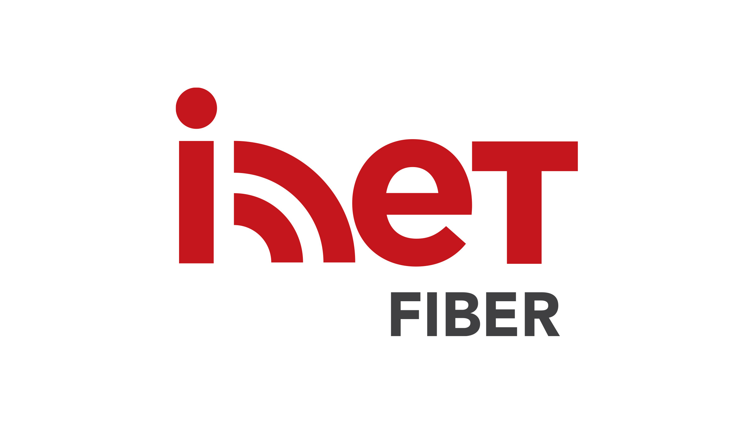
We designed a wordmark with a graphical wifi symbol replacing the letter ‘n’. To convey the aspects of the service offered by inet such as speed and data offers, we adopted the phrase ‘Get Set Go’, which is used for races. Replacing the word ‘go’ with ‘net’, we derived the position ‘Get Set Net’ to verbalise speed.