Blending the magic of science with the goodness of natural ingredients.
Building brand identity and package design for a skin and hair care brand that actually cares for the users by providing scientific solutions.
Branding
Building brand identity and package design for a skin and hair care brand that actually cares for the users by providing scientific solutions.

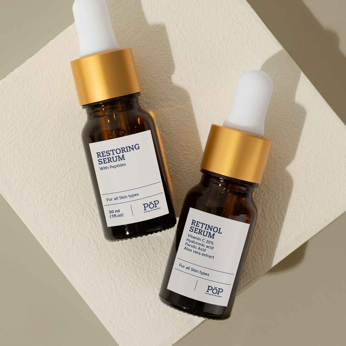
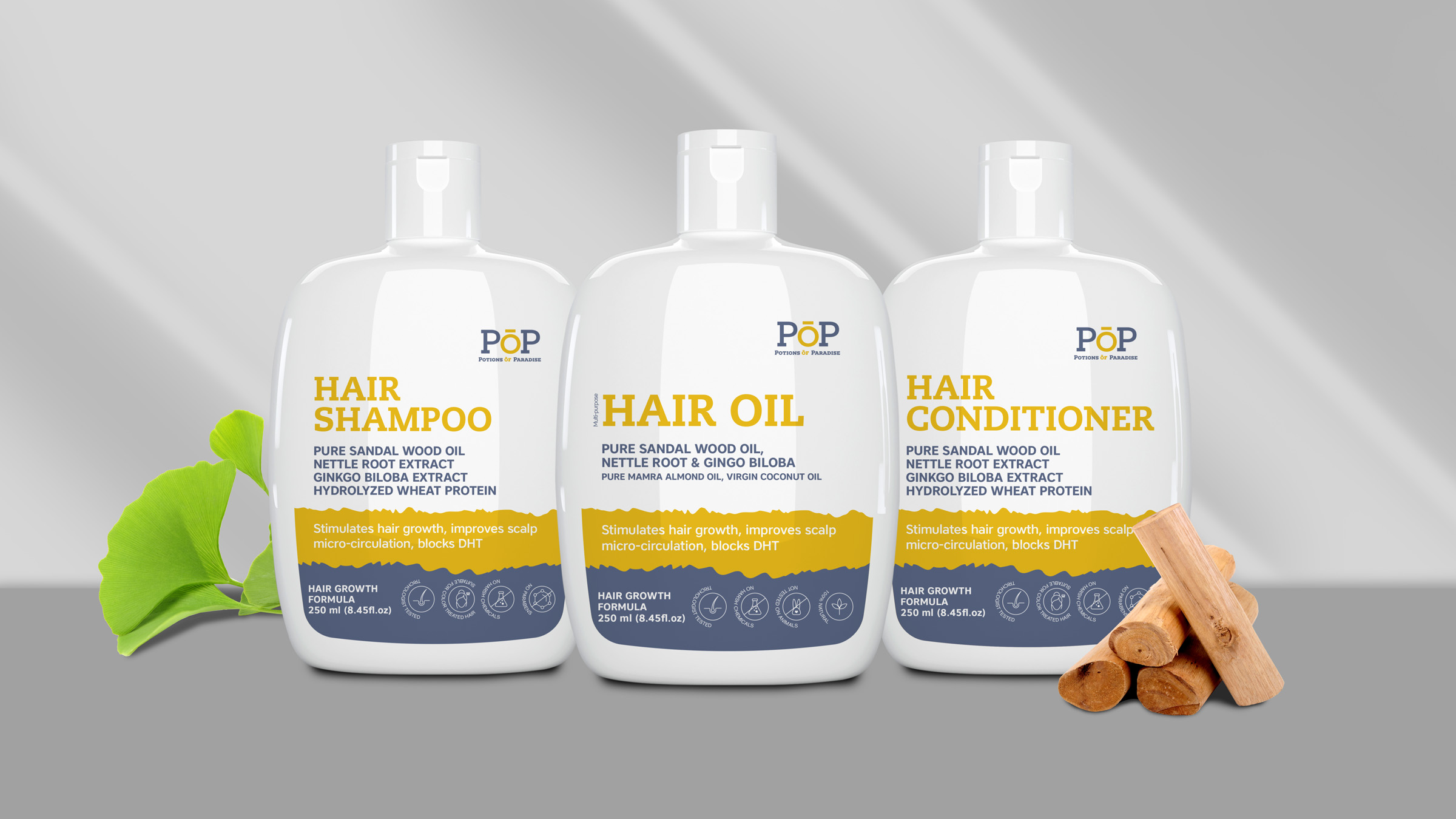
Potions of Paradise (POP) is a skin and hair care brand powered by evidence-based solutions and science-backed formulae. The task was to capture the essence of the nature of the brand without losing out on the interests of the customers. We had to design a suitable logo and a warmly welcoming packaging.
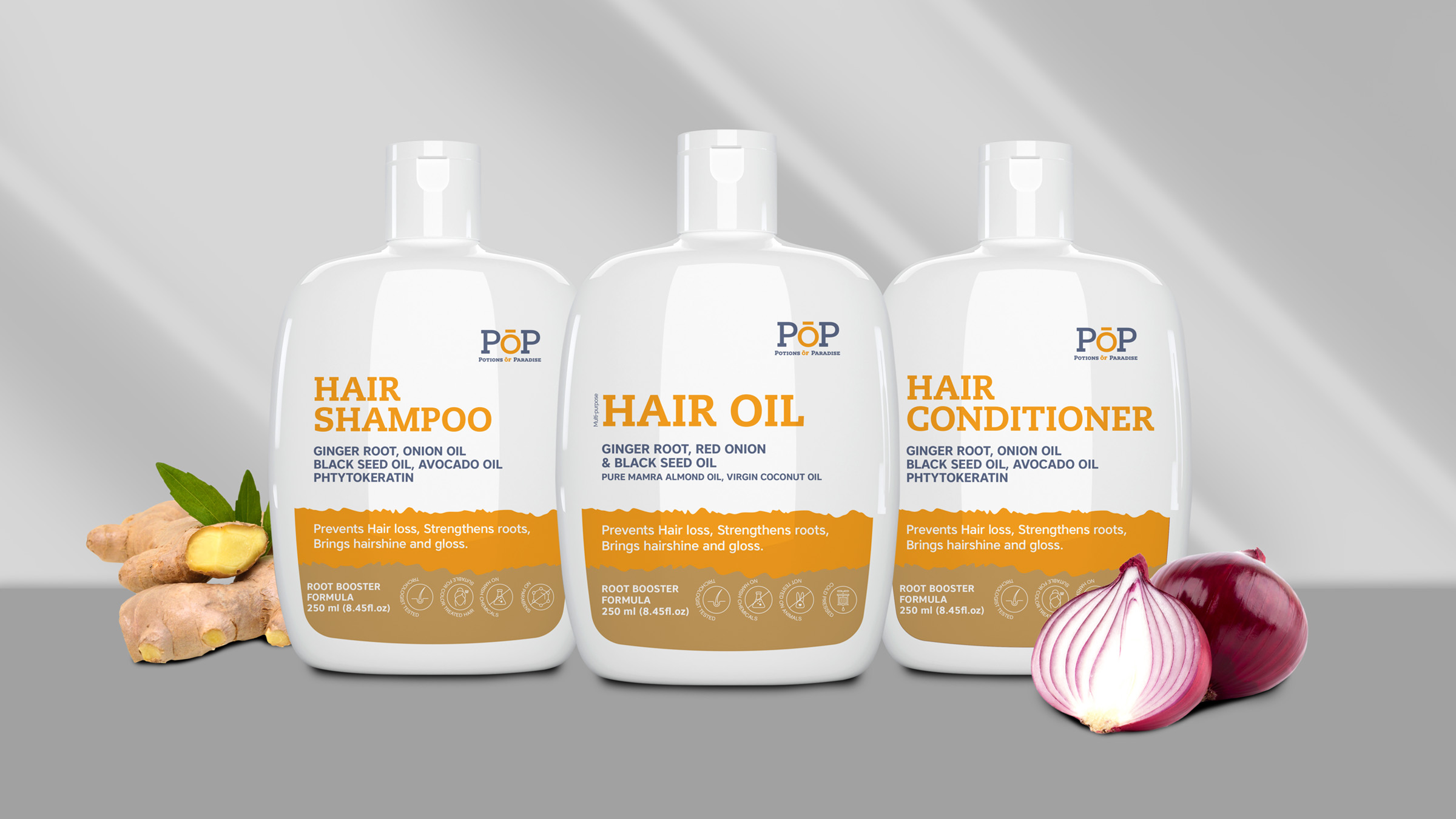
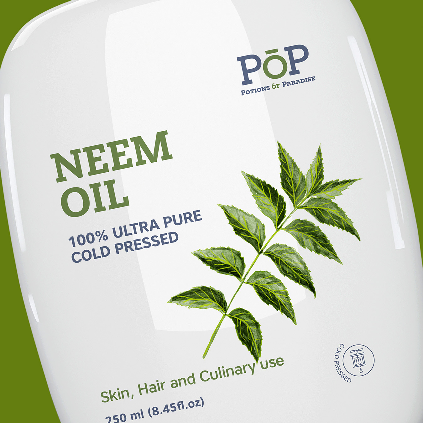
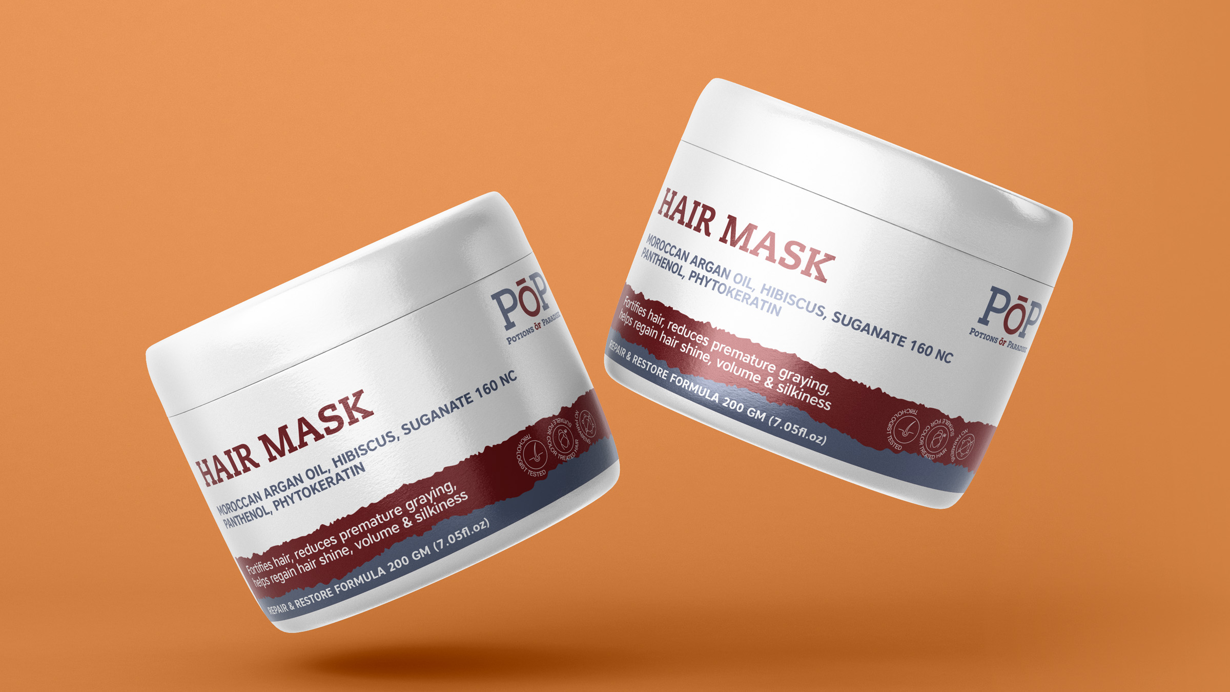
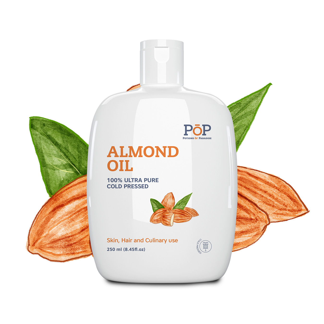
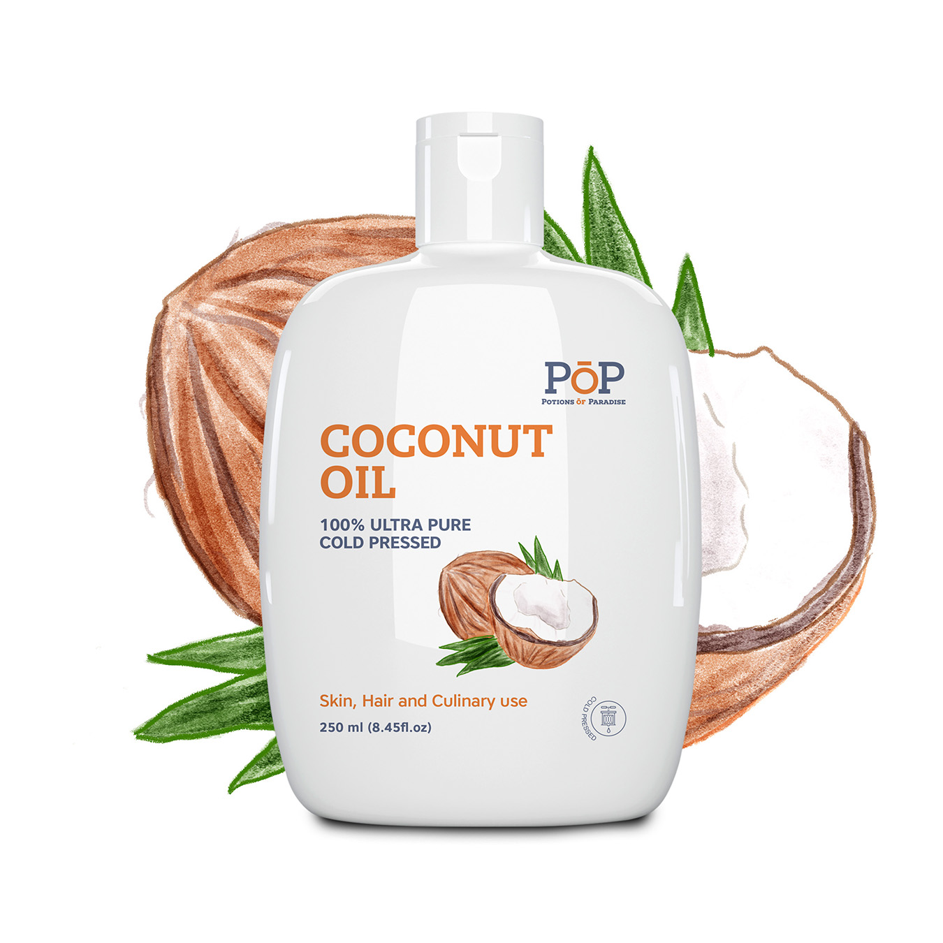
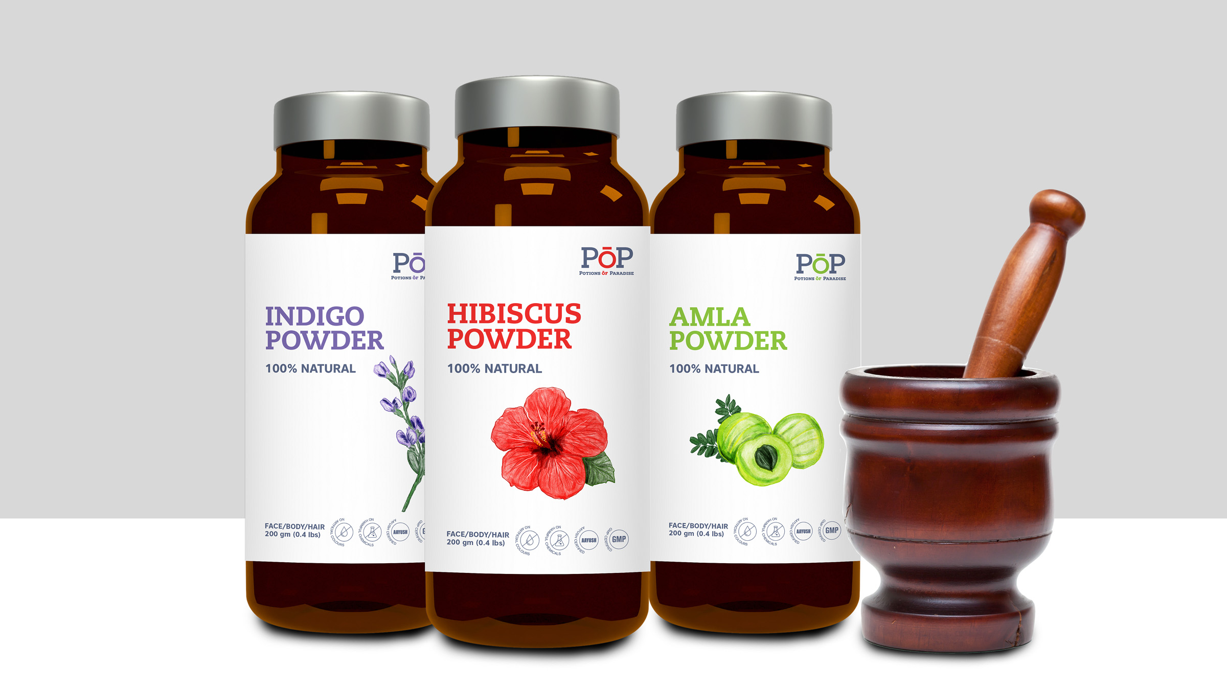
POP needed an appealing package design that secures a place for the brand in the market and also gives the products a competitive edge. Along with this, the package should contain natural elements to suggest the ingredients used.
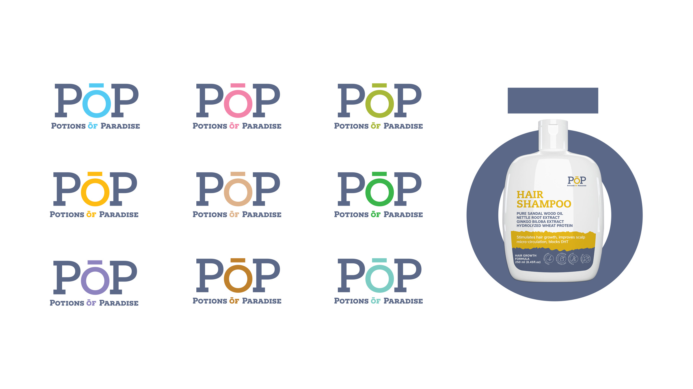
To derive a memorable brand identity, we designed a wordmark containing the abbreviation - POP and we characterized the letter ‘O’ with a distinct look and shape. And to accommodate the range of products in the brand, we developed a colour scheme containing various schemes.