Connecting every dot in the workflow, missing none.
Moving each visual element in harmony to capture the brand identity of a logistics solutions company.
Branding
Moving each visual element in harmony to capture the brand identity of a logistics solutions company.
LogicFlow identifies this poorly-organized sector as a pressing problem, which needs practical and functional solutions. It calls this the ‘Workflow’ that can make or break a business. They need to brand their idea - ‘workflow as a service' that helps businesses streamline their resources and supply chain.
LogicFlow untangles and simplifies everything about logistics, and amplifies efficiency. They help their clients to make optimal use of the fleet by providing crucial information. There are several companies that provide software solutions in logistics, but LogicFlow is beyond a solution. It is a system.
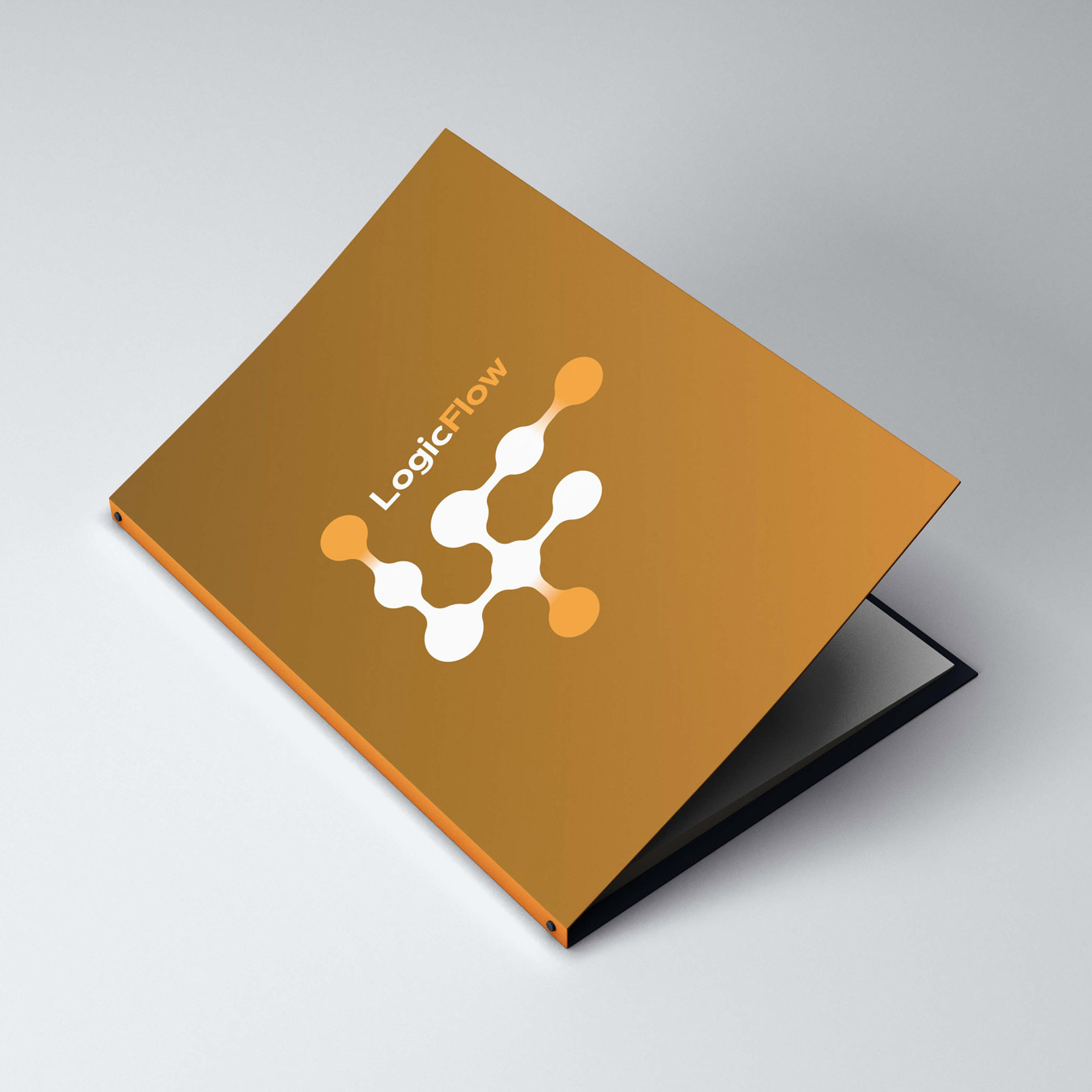
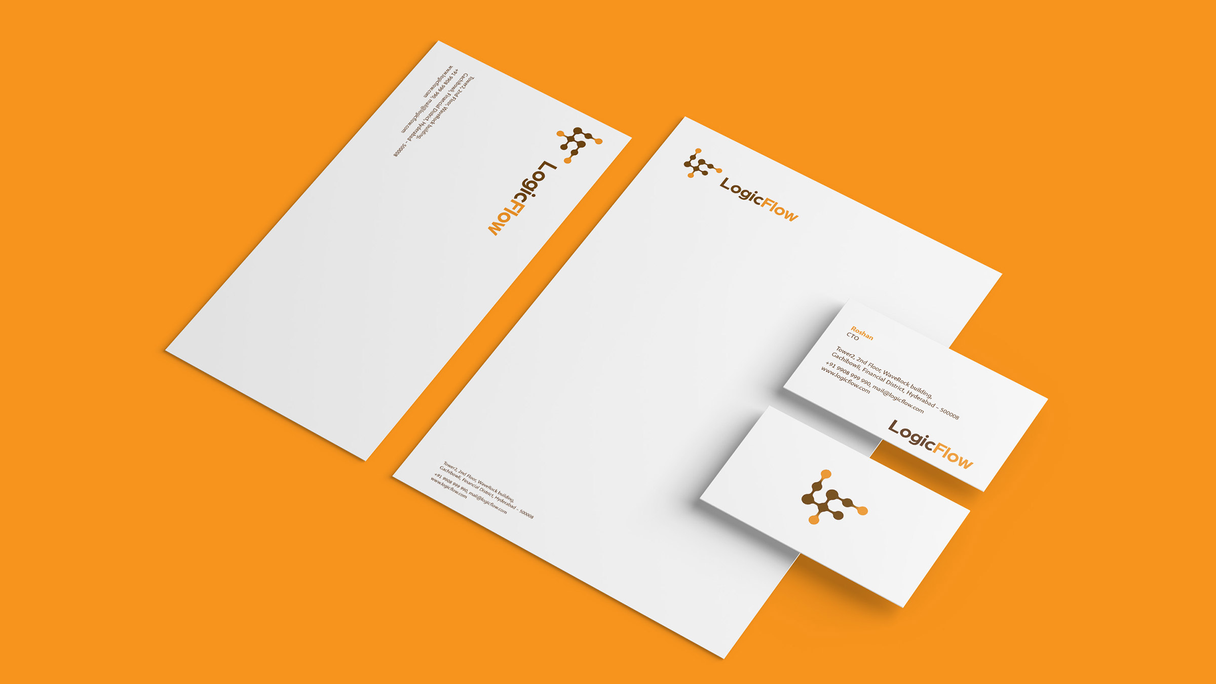
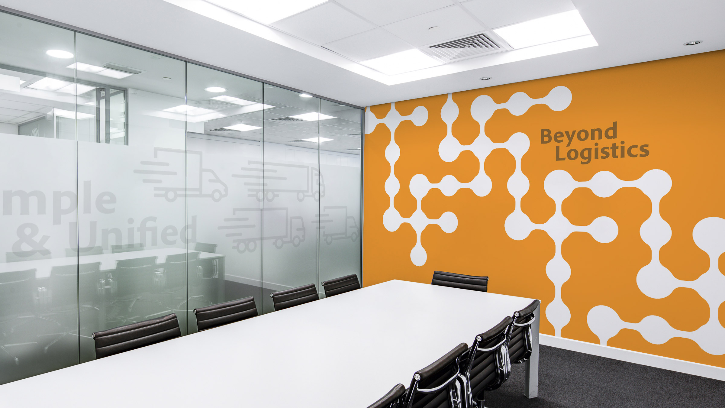
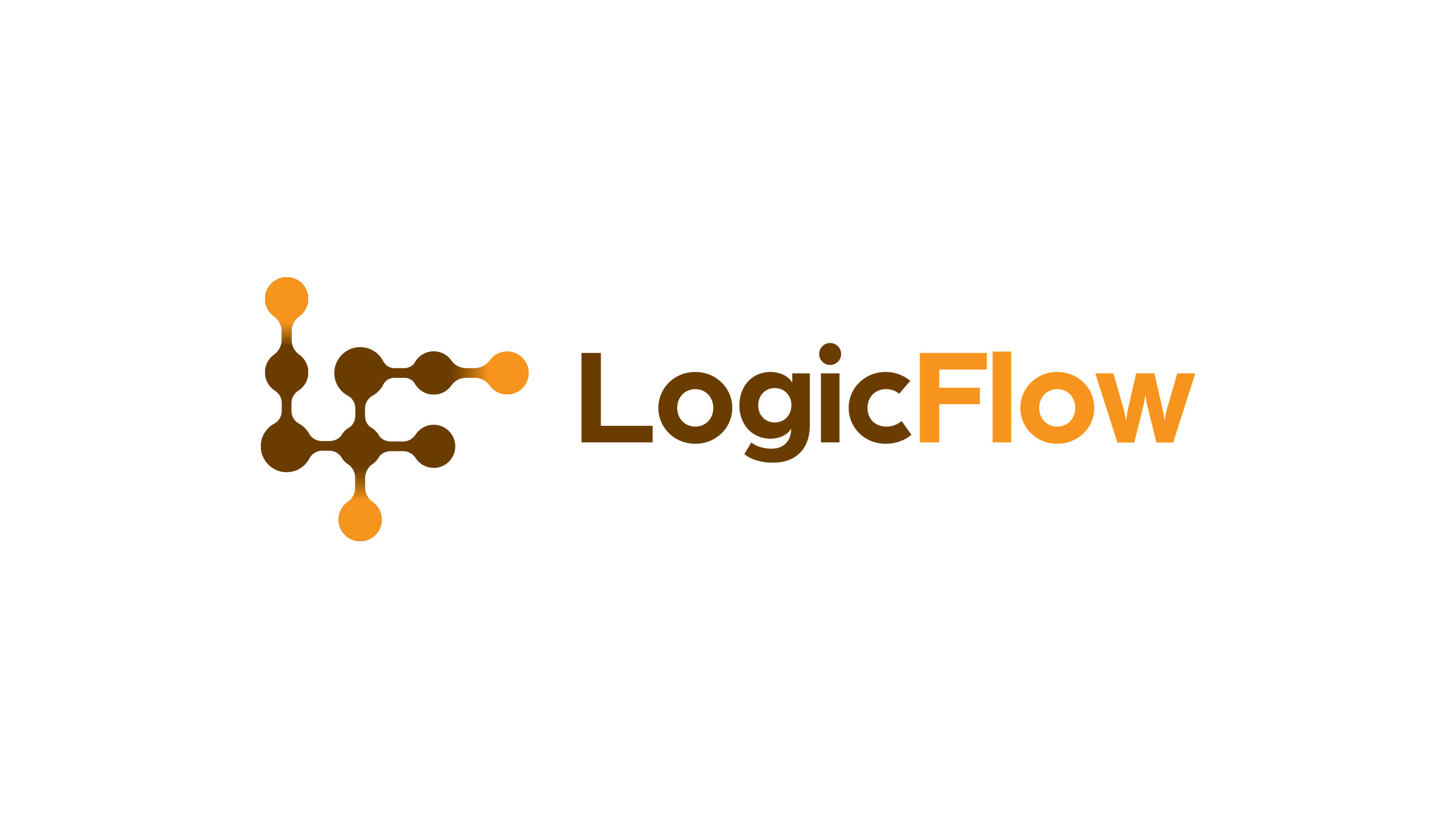
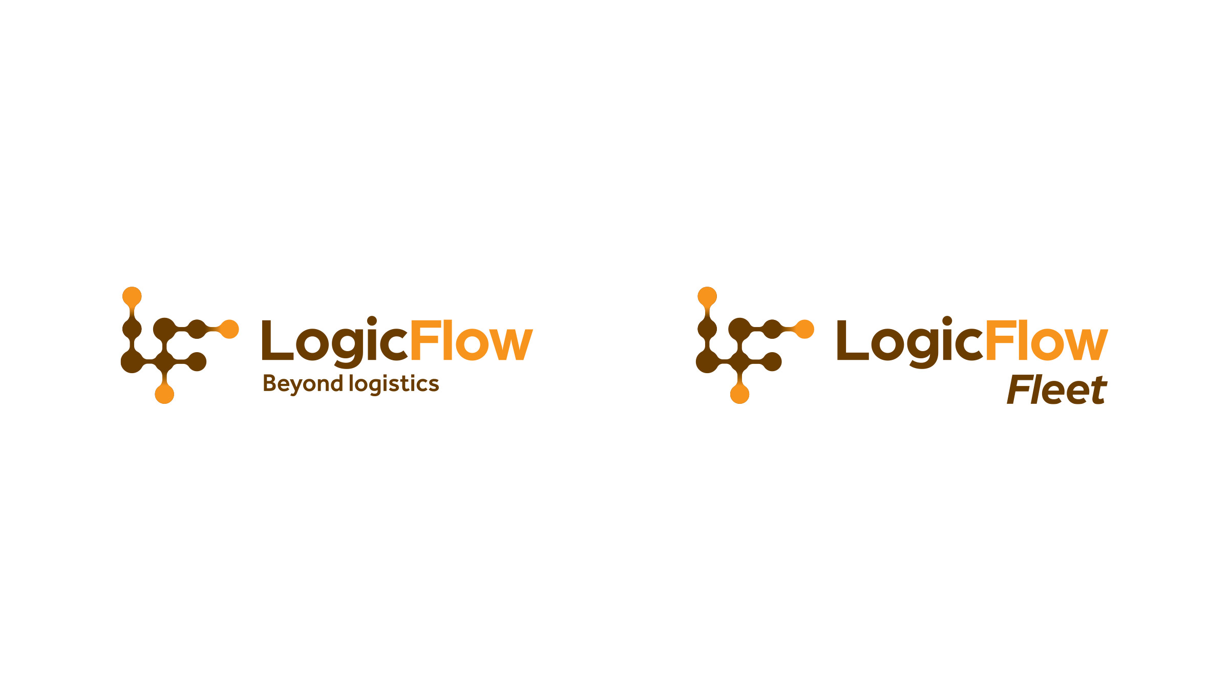
By adopting the philosophy of connecting the dots, we designed a simple logo that is partly a wordmark. Each dot in the logo is connected to the next dot suggesting the nature of the business of the brand and also the problem it is solving. Complementing the logo, we have derived the brand communication voice with the words ‘ability’ and ‘agility’.